UK Money Reality Checker
This tool helps users quickly understand their financial situation in the UK by turning complex information into a clear, structured experience. The project focused on simplifying financial data into an interface that supports confident, everyday decision-making.
Role
UX + Front-End
Stack
HTML, CSS, JavaScript
Timeline
4 days
The problem
Understanding your real financial situation in the UK is often unclear. People rely on multiple sources, estimates, or incomplete information, making it difficult to see a reliable overall picture.
There wasn’t a simple way for users to enter their details and get a clear, practical breakdown of their finances. This lack of clarity makes it harder to make informed decisions.
Goals
- Help users quickly understand their financial situation
- Reduce confusion with clear, structured outputs
- Create a simple, intuitive flow with minimal effort required
- Ensure the experience works smoothly across all devices
Process
Discover
I found that the main issue wasn’t access to information, but how that information is presented. Many existing resources overwhelm users or fail to provide clarity, leaving people unsure about their finances even after engaging with them. The key insight was that users don’t need more data — they need better structure and clearer outputs that are easy to understand and act on immediately.
Design
I designed a simple input-to-output flow focused on clarity and ease of use. The interface guides users step by step, groups related information logically, and presents results in a way that is easy to understand at a glance. Every design decision was made to reduce cognitive load and create a smooth, intuitive experience.
Build
I built the interface using HTML, CSS, and JavaScript, focusing on responsiveness and usability. The structure is clean and semantic, supporting accessibility, and the layout adapts seamlessly across devices. JavaScript was used to handle user input and dynamically update outputs, keeping the experience fast, simple, and reliable.
Refine & Launch
Refinements focused on improving spacing, readability, and the clarity of outputs. Small adjustments to layout and content hierarchy made the final product feel more polished and easier to use. The result is a focused tool that allows users to quickly understand their financial situation without friction.
Solution
The final solution transforms a complex problem into a clear, easy-to-use experience, helping users quickly and confidently understand their finances.
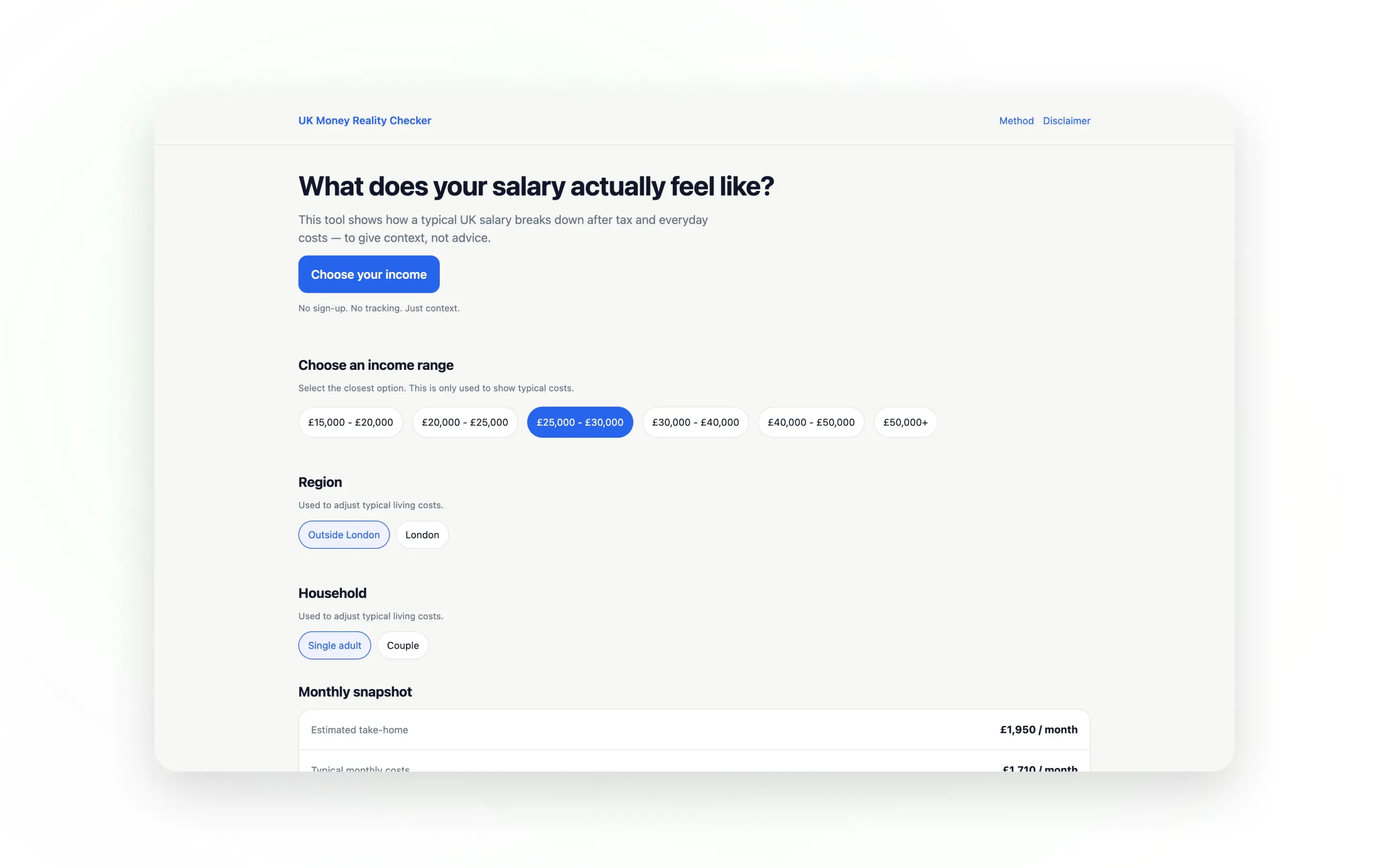
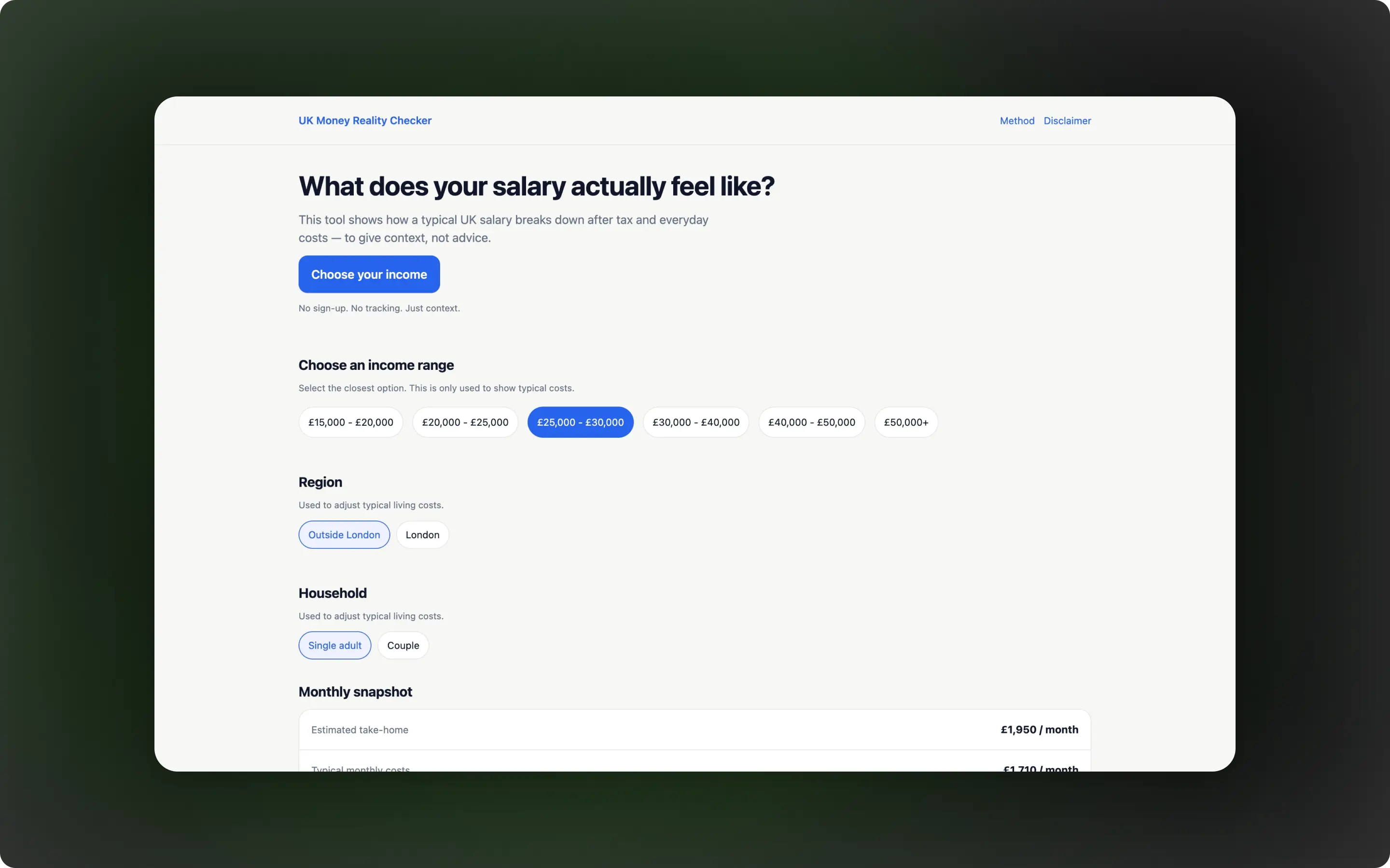
Structured Input Flow
Inputs are organised step by step, guiding users through the process without overwhelming them. This creates a smooth and approachable experience for a wide range of users.
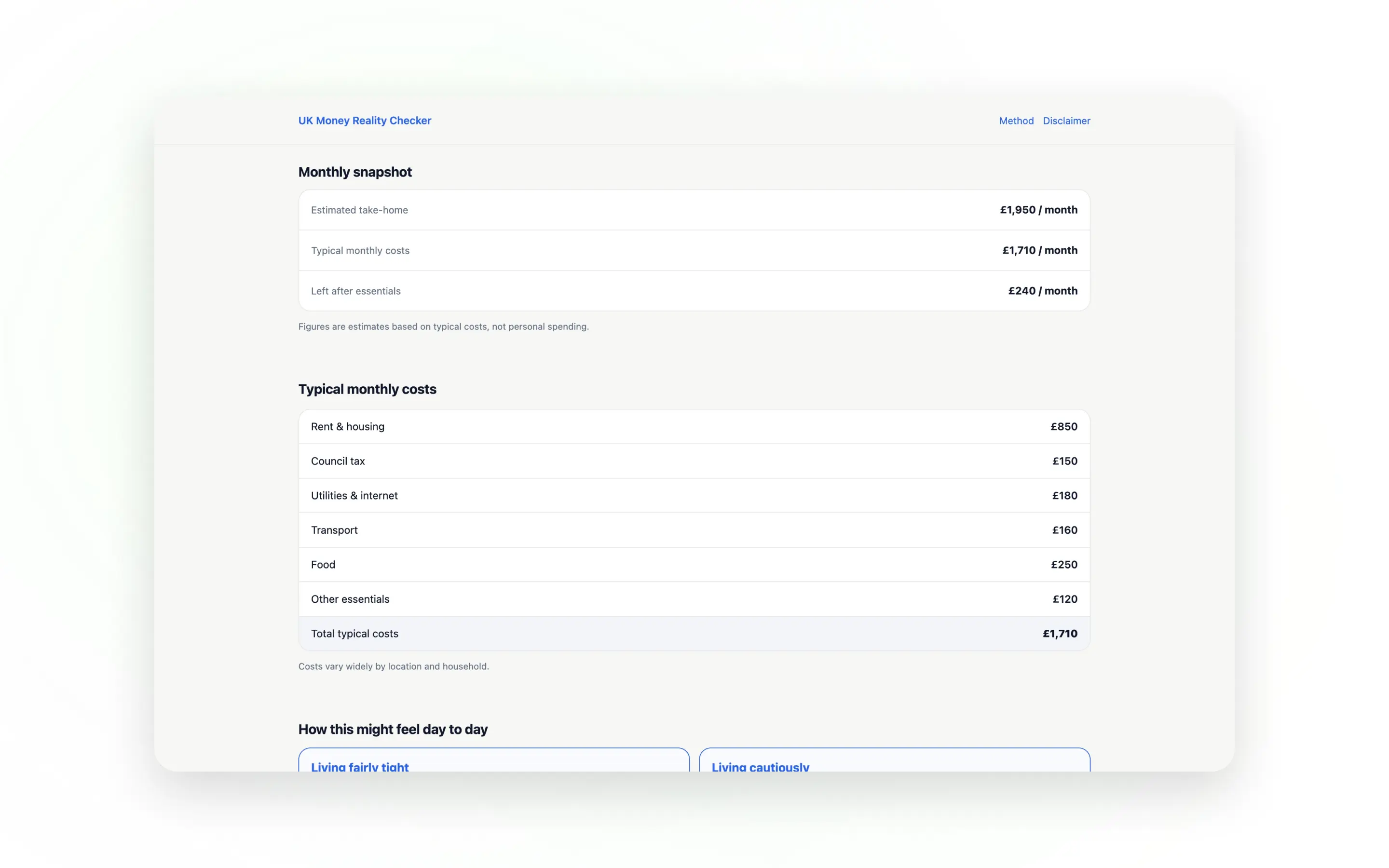
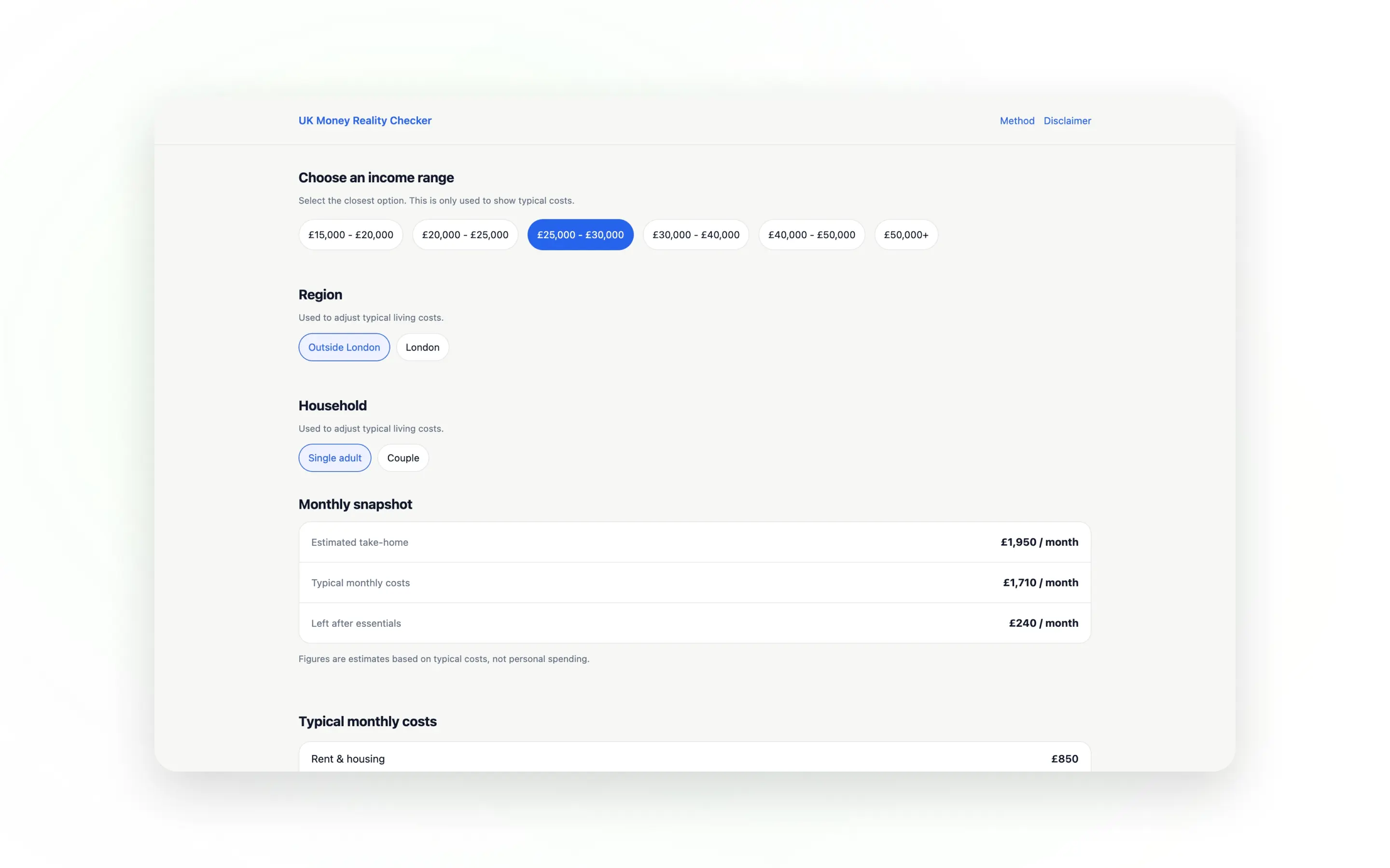
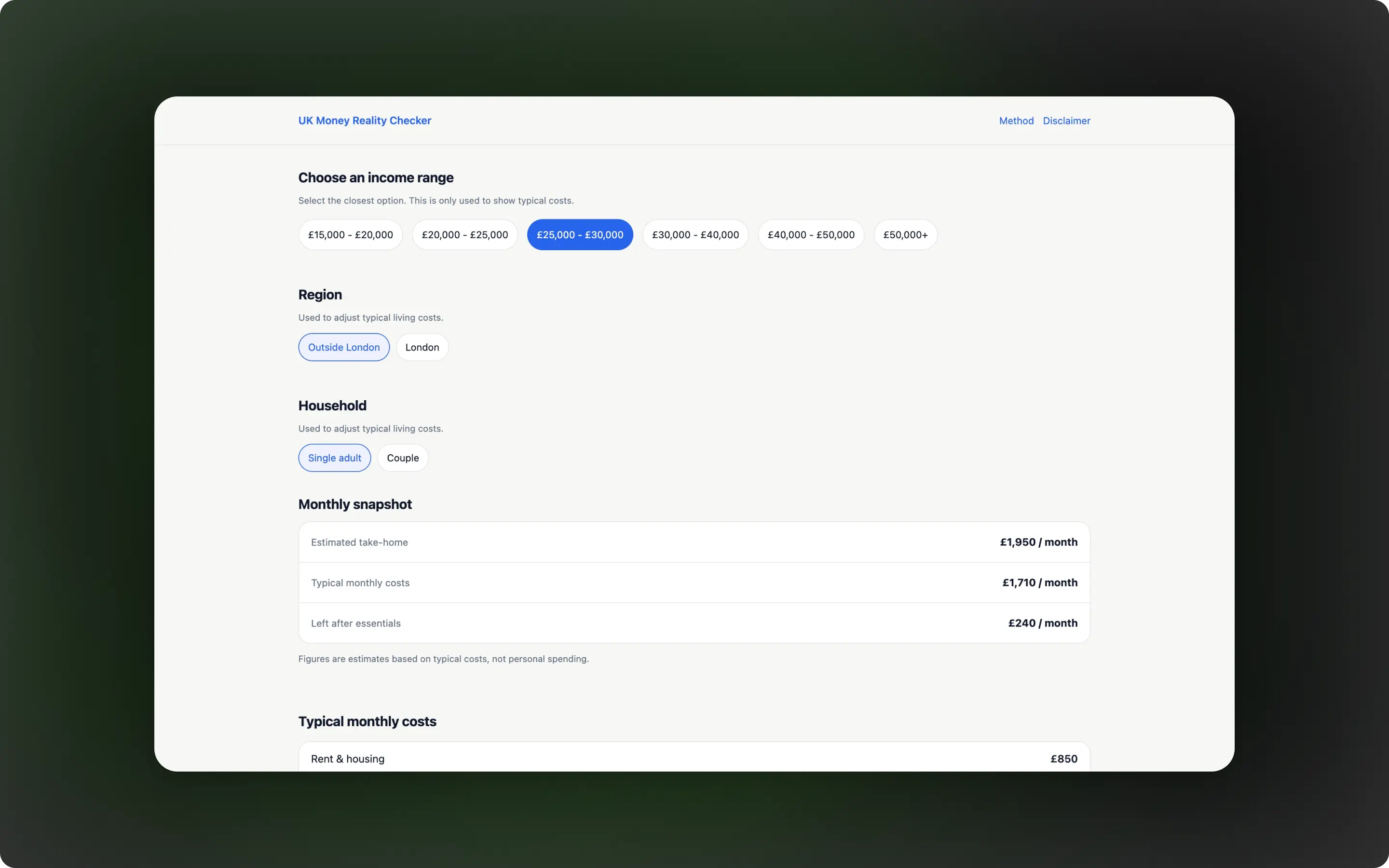
Clear Output Presentation
Results are displayed in a simple, easy-to-read format, allowing users to quickly identify the most important information and understand their financial position.
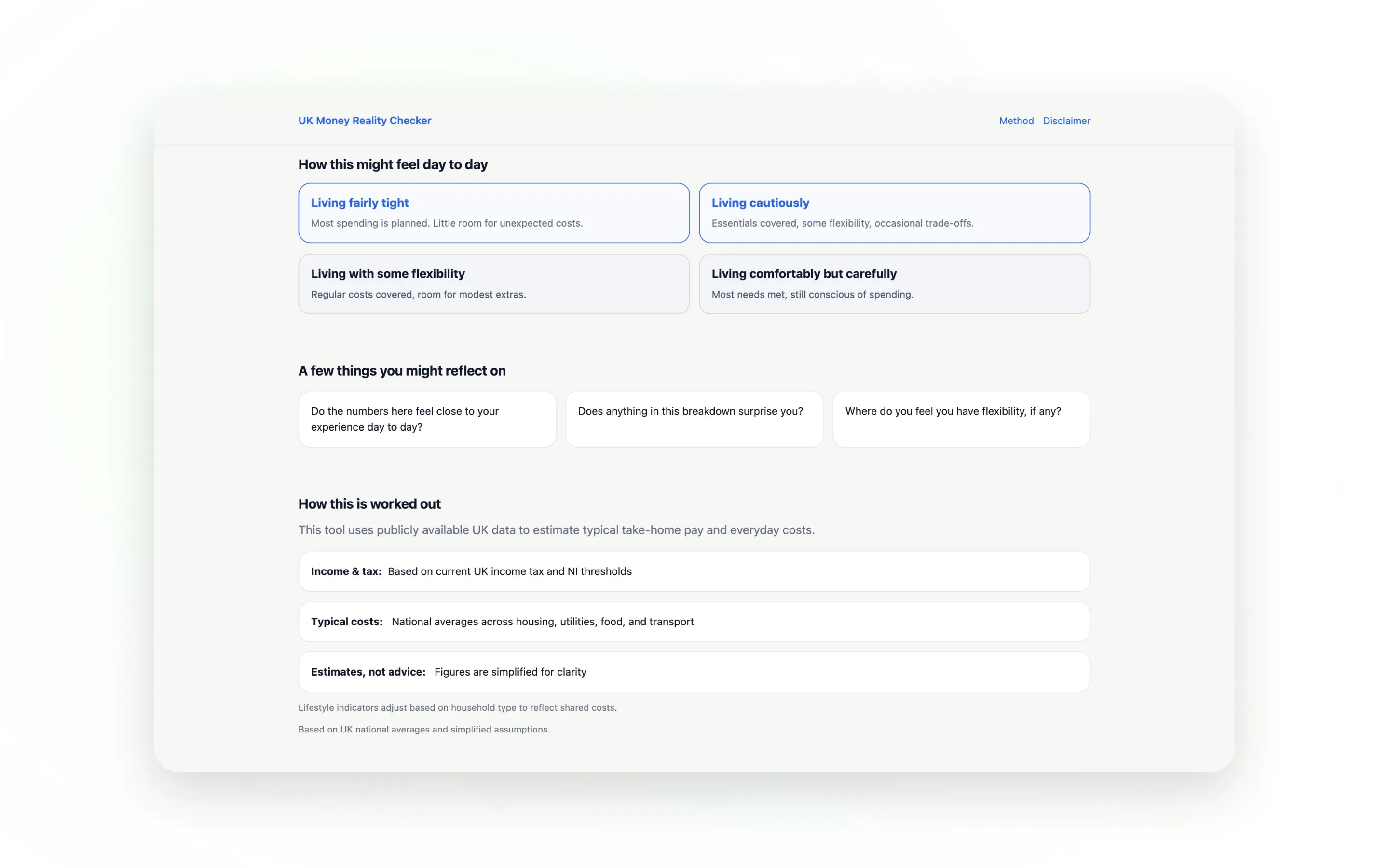
Clarity-First Design
The interface removes unnecessary complexity and focuses only on what matters. This improves usability and ensures the experience remains straightforward and effective.
Outcome
The final product demonstrates how complex financial information can be simplified into a clear, usable tool that supports better everyday decision-making.
- Simplifies complex financial information into clear insights
- Helps users quickly understand their financial position
- Fully responsive and accessible across devices
- Built with a scalable foundation for future features
Reflections
This project reinforced that good UX is less about adding features and more about making information clear and usable. The challenge wasn’t complexity — it was deciding what to remove and how to present what remained.
It showed that the most effective interfaces come from simplifying problems and helping users understand what matters, rather than overwhelming them with unnecessary detail.
Like this project?
If you like how I think and build, send a message and tell me what you need. I'll reply by email.