Cities Under Watch
Cities Under Watch is a Django-powered digital poster store for a fictional dystopian art brand. The project combines e-commerce functionality, atmospheric worldbuilding, responsive design, and digital product delivery to create a store experience built around collectible poster editions.
Role
Full-Stack Developer (UX-led)
Stack
Django, Python, HTML, CSS, JavaScript, Bootstrap, Heroku
Timeline
3 weeks
The problem
Digital art stores need to do more than display products. Users need to understand what they are buying, how the digital delivery works, whether the files are suitable for printing, and how to access their purchases after checkout.
The challenge was to create a fictional poster store that felt visually distinctive and immersive, while still functioning as a clear e-commerce experience. The site needed to balance atmosphere and storytelling with practical user needs such as browsing, product selection, account access, bag functionality, checkout, FAQs, and delivery information.
Goals
- Build a full-stack Django e-commerce project for digital poster products
- Create a strong fictional brand identity with a clear visual direction
- Allow users to browse posters, collections, and product details
- Support bag functionality and an e-commerce-style purchase journey
- Explain digital delivery clearly through FAQs and support content
- Provide account access for orders and downloads
- Design a responsive interface that works across screen sizes
- Deploy the finished application online
Process
Discover
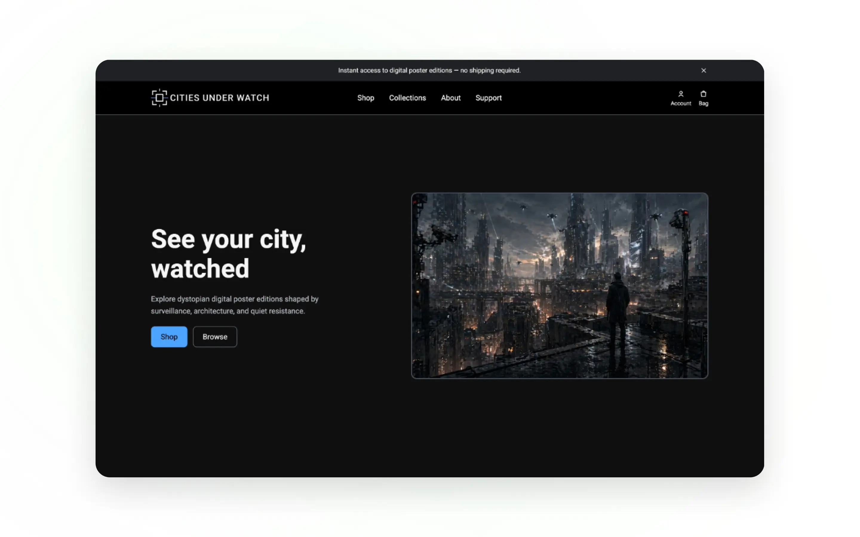
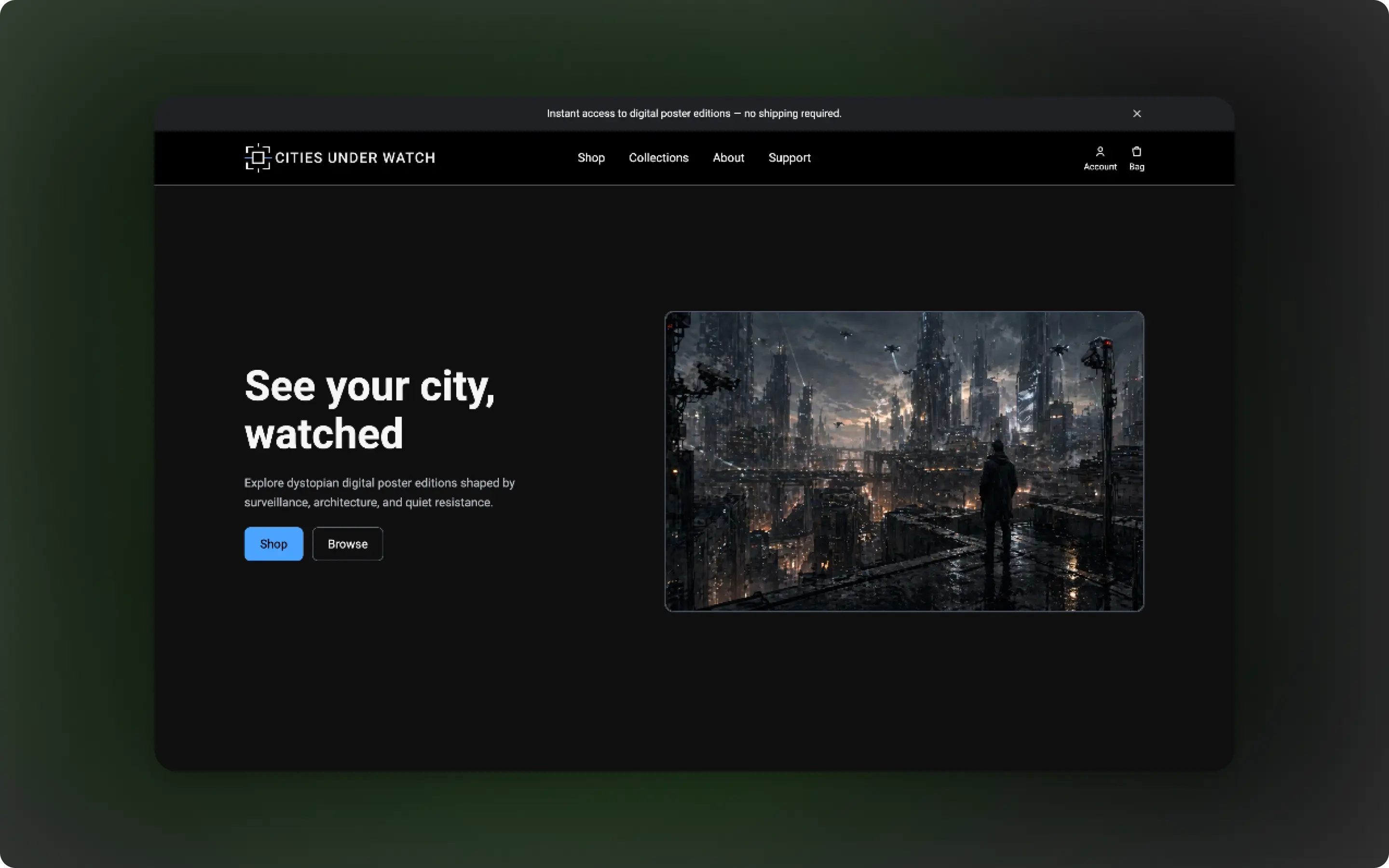
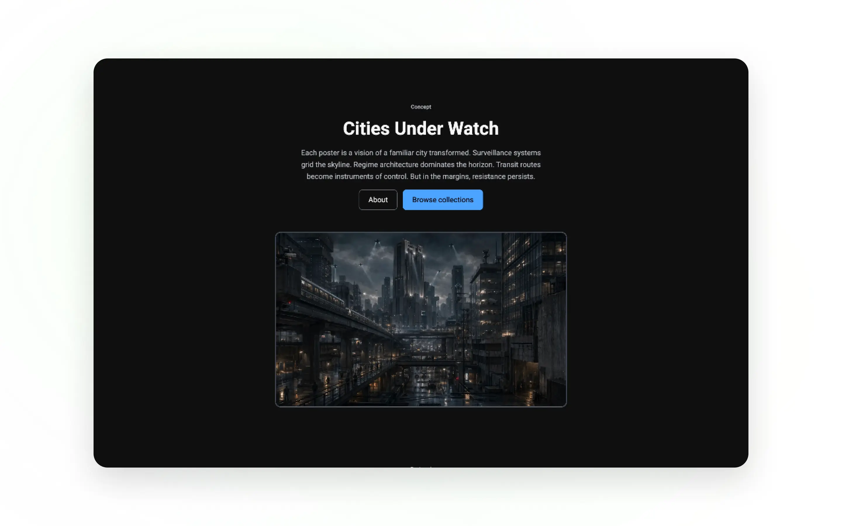
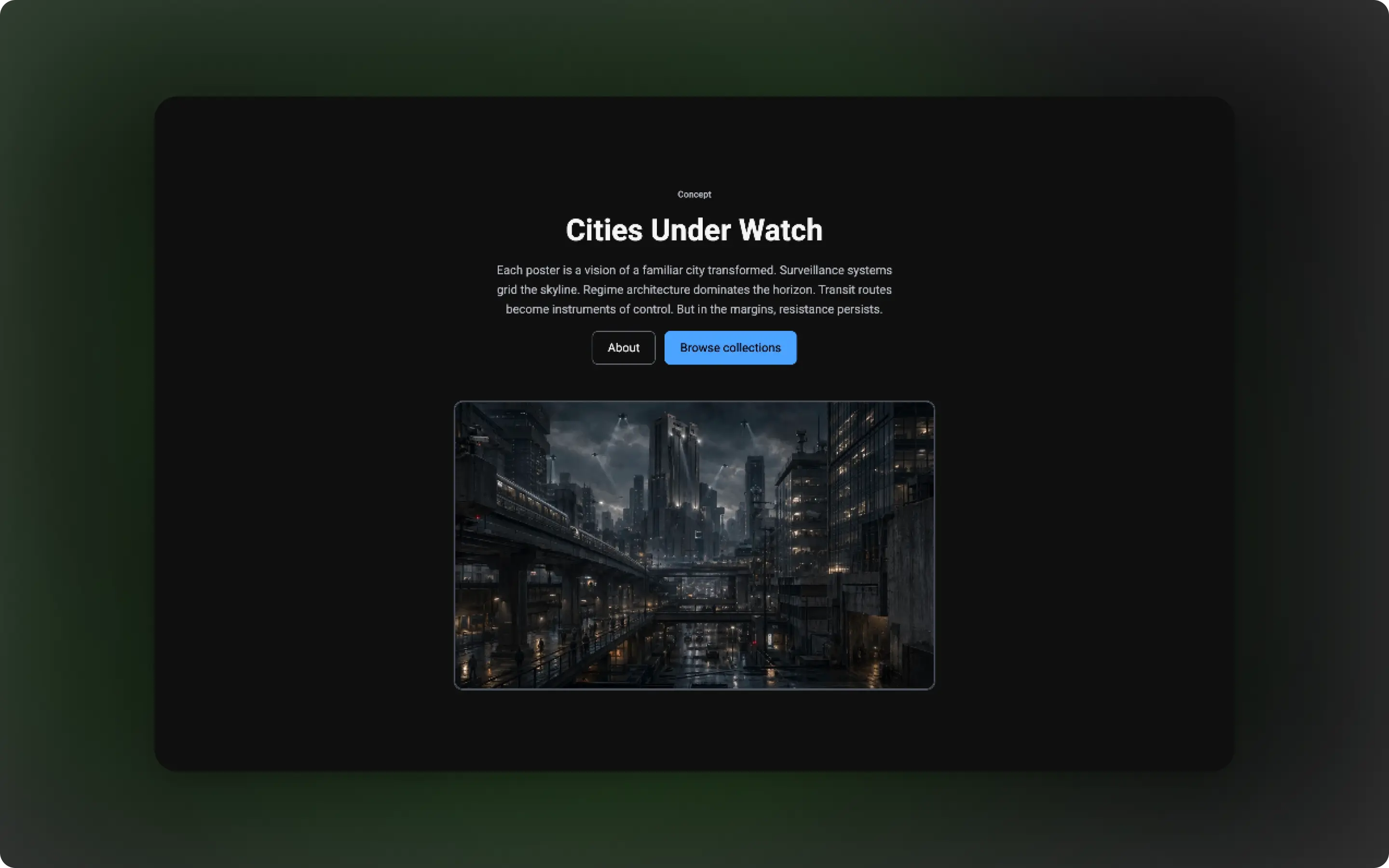
I started by defining the project as more than a standard product catalogue. The store needed a strong concept, so I developed Cities Under Watch around dystopian city artwork, surveillance, authoritarian architecture, and quiet resistance.
The key insight was that the products needed to feel connected to a larger fictional world. This meant the user experience had to support both shopping and storytelling. Users needed to quickly understand that the products were digital posters, while also being drawn into the atmosphere and narrative behind the brand.
Design
The design direction focused on creating a dark, cinematic, editorial feel. I planned the user journey around a simple e-commerce flow: discover the brand, browse the posters, view product details, add items to the bag, and understand how digital delivery works.
The homepage was structured to introduce the concept first, then guide users into featured prints, narrative content, the download process, product quality information, and future releases. This helped the store feel more complete and trustworthy, rather than just a grid of products.
Build
I built the application using Django, with separate areas for product browsing, account access, bag functionality, support content, and legal information.
The backend structure supports an e-commerce-style flow, while the frontend templates focus on clear hierarchy, responsive layouts, and consistent visual styling. HTML and CSS were used to build the page structure and visual interface, while JavaScript supported interactive behaviour where needed.
Because the products are digital downloads, the build also needed to consider how users understand instant access, order history, and download availability.
Refine & Launch
Refinements focused on improving clarity, consistency, and confidence across the store. I reviewed the homepage flow, product messaging, account links, support content, and digital delivery information to make sure users could understand the buying process.
The final version was deployed to Heroku, creating a live Django project that demonstrates both full-stack development and brand-led interface design.
Solution
Cities Under Watch turns a fictional digital art concept into a complete e-commerce experience. The solution combines a strong dystopian brand identity with practical shopping features, helping users browse, understand, purchase, and access digital poster editions.
Brand-Led Storefront
The homepage introduces the fictional world before asking users to shop. Instead of presenting the store as a generic product catalogue, the interface uses atmospheric imagery, dystopian copy, and editorial-style sections to make the posters feel like part of a larger creative universe.
This helps users understand the concept quickly while giving the project a distinctive visual identity.
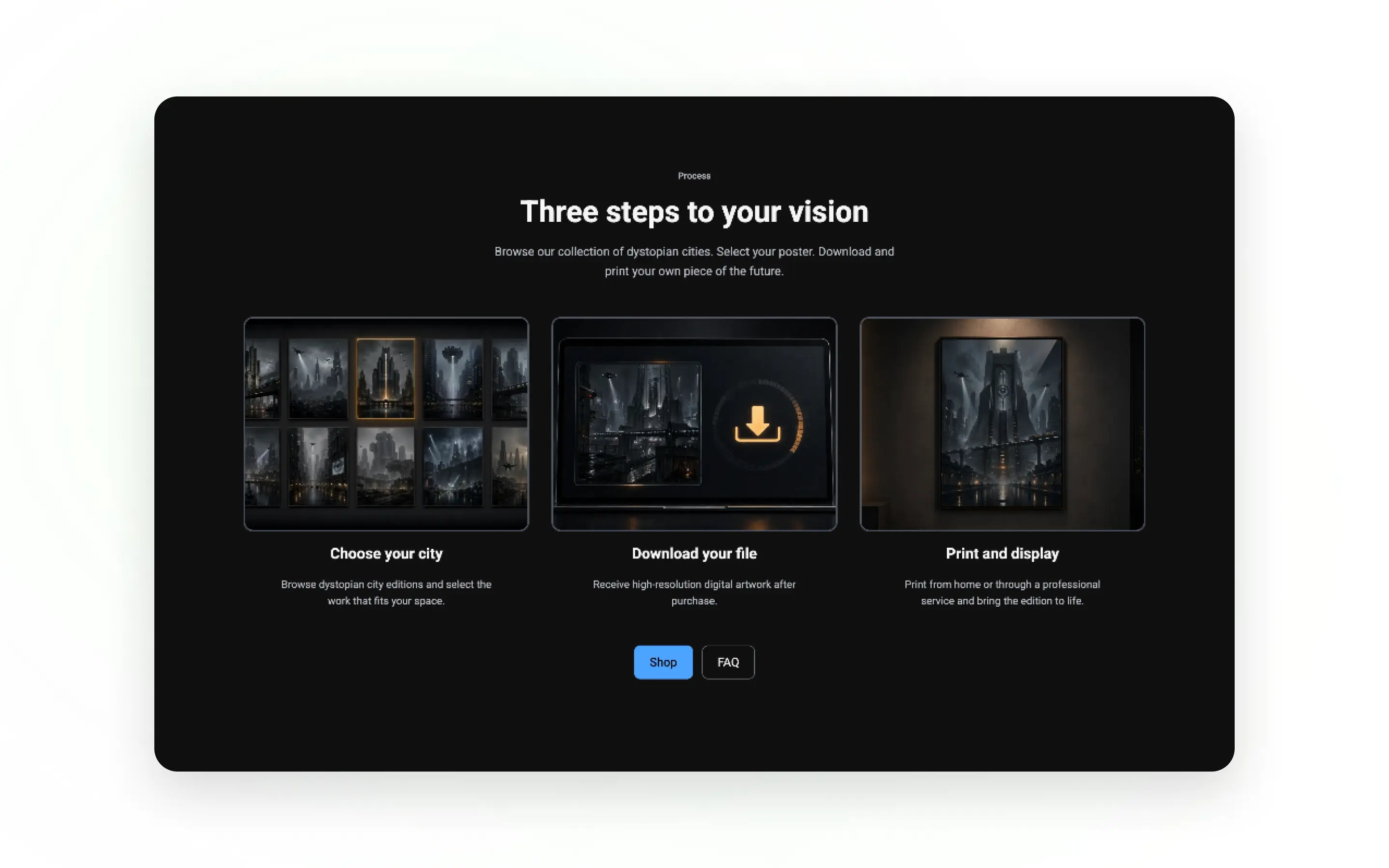
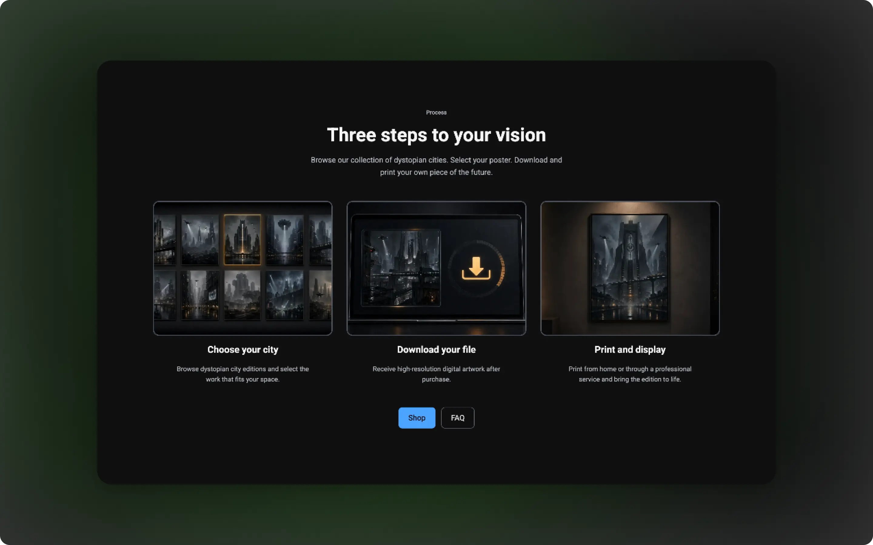
Digital Product Journey
The store explains the digital buying process clearly, from choosing a poster to downloading the file and printing it. This is important because users need to know that no physical item is shipped and that their purchase gives them access to a downloadable digital file.
By making the process visible on the homepage and supporting it through FAQ and delivery content, the site reduces confusion and builds trust around the purchase journey.
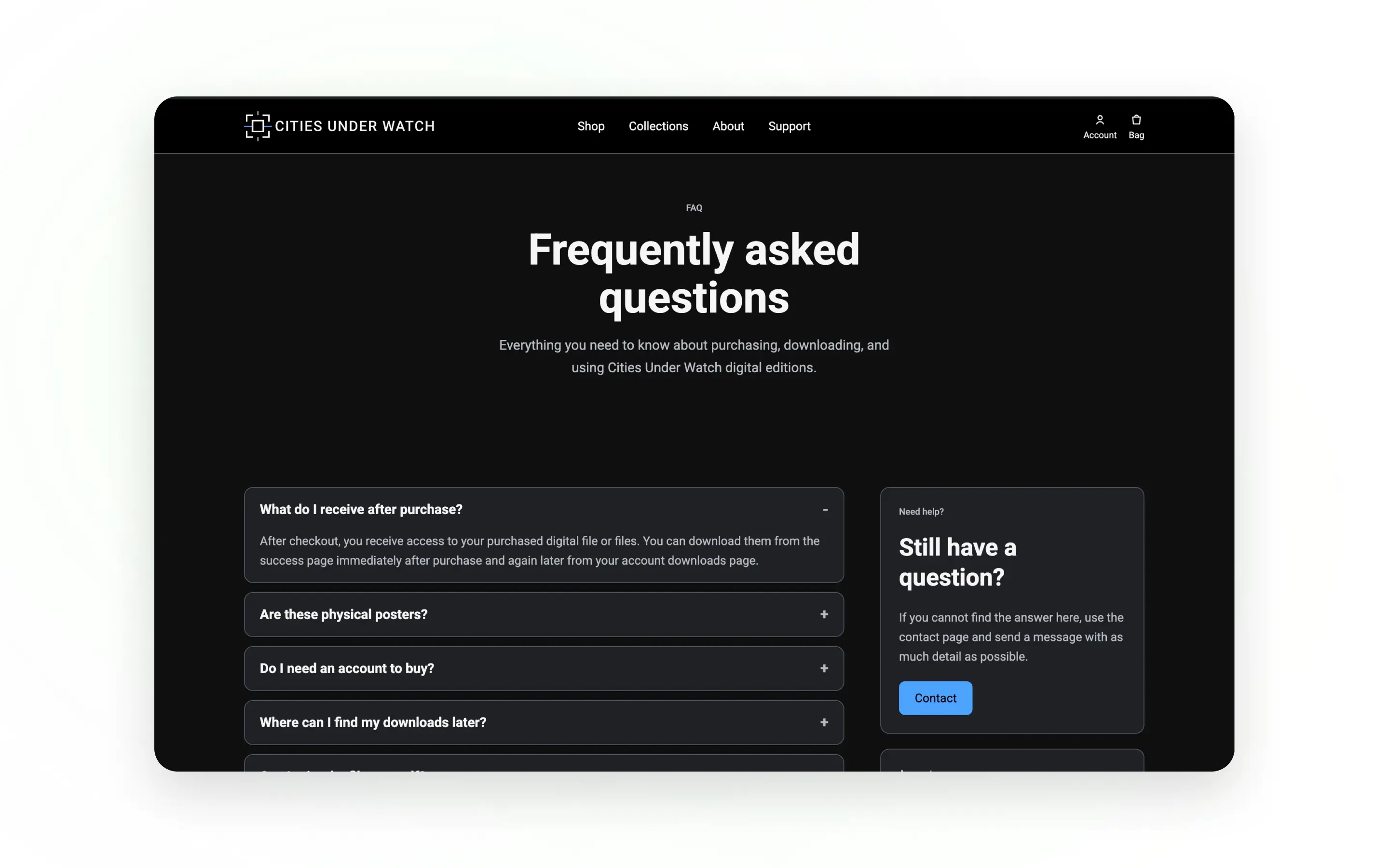
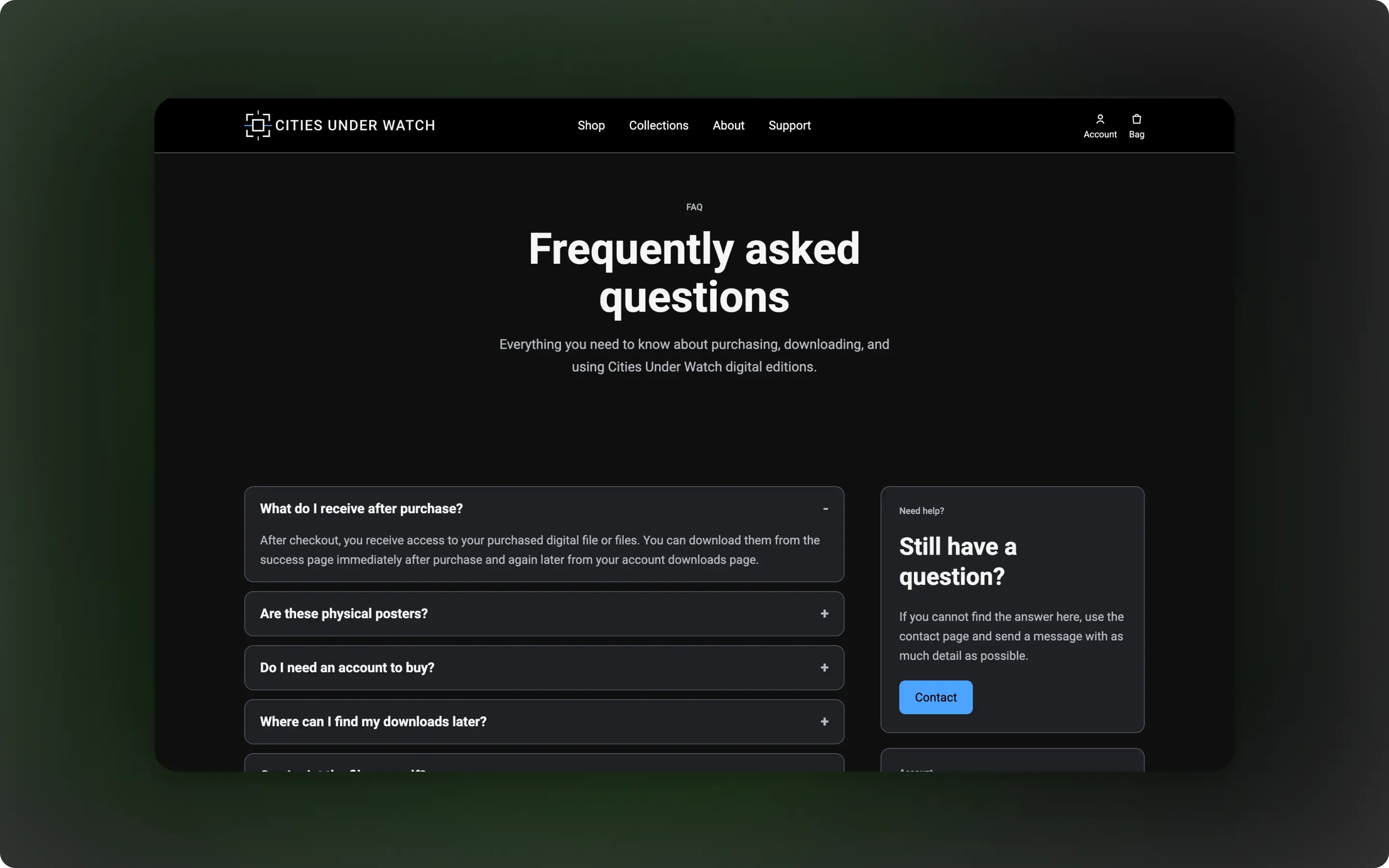
Supportive E-commerce Structure
The project includes the wider structure users expect from an online store, including account access, bag functionality, FAQs, delivery information, refunds, terms, and privacy pages.
These supporting pages make the store feel more credible and complete. They also show that the user journey was considered beyond the homepage, including what happens before, during, and after purchase.
Outcome
The final project is a live Django e-commerce application that combines digital product functionality with a strong fictional brand identity. It demonstrates my ability to design and build a full-stack store experience while thinking about user trust, content structure, product presentation, and responsive design.
- Built and deployed a full-stack Django e-commerce project
- Created a fictional digital poster brand with a distinctive dystopian identity
- Designed a responsive storefront for browsing poster editions
- Added account, bag, support, FAQ, and legal page structure
- Clarified the digital download journey through homepage and support content
- Created a scalable foundation for future products, collections, and store features
Reflections
This project helped me strengthen the connection between visual design, storytelling, and full-stack development.
One of the biggest lessons was learning how important clarity is in a digital product store. Because the posters are downloadable rather than physical products, the interface needed to explain what users receive, how they access it, and what happens after purchase.
The project also reinforced the value of building a strong concept around a technical project. Cities Under Watch gave me the opportunity to create something that was not only functional, but also visually distinctive and memorable.
Going forward, I would continue improving the project by expanding the product range, adding stronger filtering, improving the account download experience, and developing the brand into a more complete digital art platform.
Like this project?
If you like how I think and build, send a message and tell me what you need. I'll reply by email.